
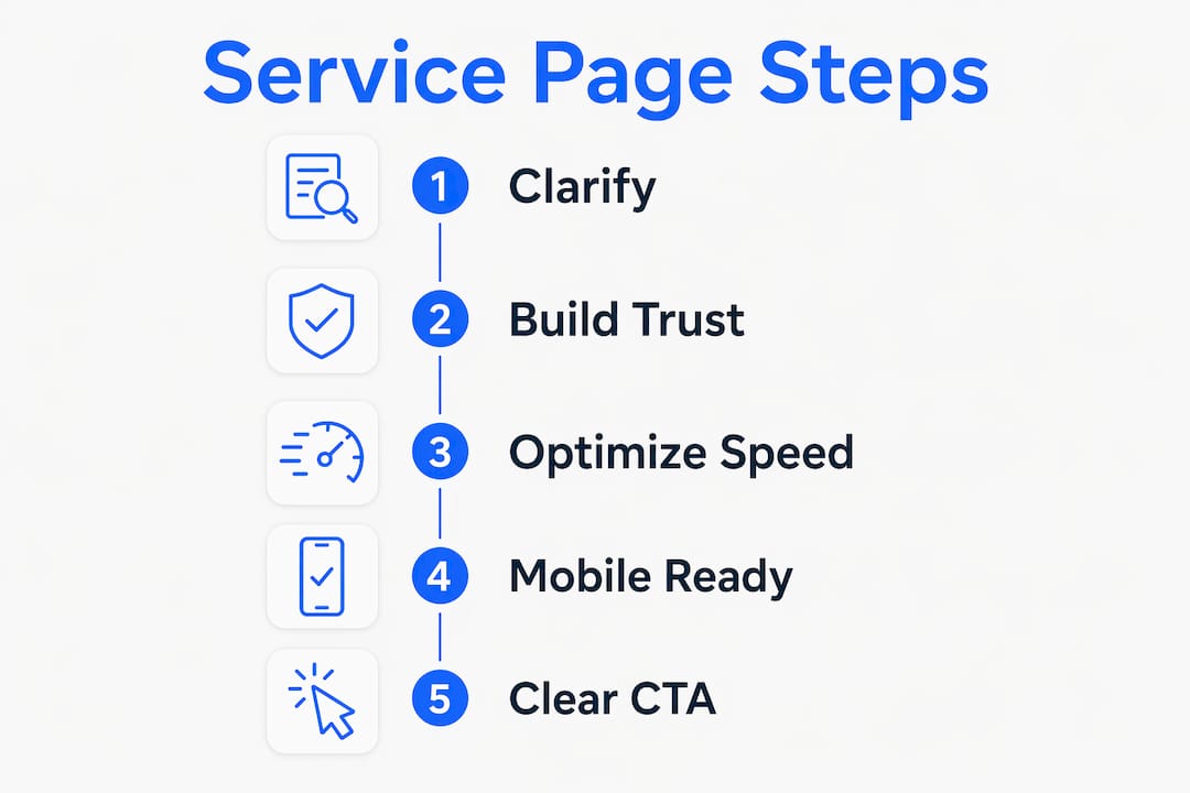
A service page that converts visitors is defined as a page that clearly explains what you offer, helps the right person recognize they need it, builds enough trust to remove doubt, and makes the next step obvious. Most service businesses lose inquiries not because their work is poor, but because their service pages are vague, slow, or missing the right signals. The five core elements of a high-converting service page are clarity, fit, trust, expectations, and a frictionless call to action. Baylineweb builds these elements into every website it creates for tradies and service businesses in Geelong.
What essential elements make a service page convert visitors?
Service pages attract the highest-intent traffic on your entire website. A visitor landing on your plumbing or landscaping page already wants the service. The only question is whether your page convinces them you are the right choice.
A great service page does five specific things:
- Explains the service clearly. State what you do, what problem it solves, and who it is for. Avoid industry shorthand that means nothing to a first-time visitor.
- Helps visitors self-identify. Use language like "This is right for you if..." so the right people feel seen and unqualified visitors filter themselves out.
- Builds trust with specific proof. Generic five-star ratings are weak. Testimonials tied to a specific job, location, or outcome carry real weight. Case studies and credentials linked directly to the service work even better.
- Sets realistic expectations. Tell visitors how the process works, roughly how long it takes, and what they can expect after they reach out. Uncertainty kills conversions.
- Provides one clear next step. A simple, visible call to action removes hesitation. "Get a free quote" or "Call us now" beats a buried contact form every time.
A well-structured service page answers the visitor's specific questions about fit and trust, helping serious buyers decide quickly and confidently. That speed of decision is what separates pages that generate inquiries from pages that generate bounces.
Pro Tip: Write your service page as if you are answering a phone call from a new customer. Cover what they ask first, then address what they worry about second.
How to design a service page that performs well and feels easy to use?
Page speed is not a technical detail. Visitors form judgments on website credibility in seconds, and a slow or unstable page signals that your business is unprofessional before they read a single word. Speed and stability communicate care and competence before any content does.

Mobile responsiveness is non-negotiable for service businesses. Most people searching for a local tradie or service provider are on their phone, often mid-task. A page that requires pinching, zooming, or sideways scrolling loses that visitor immediately. Every element, from your phone number to your quote form, must work perfectly on a small screen.
Layout stability matters more than most business owners realize. Pages that shift as they load, with images popping in or buttons jumping around, create anxiety. Faster, steadier pages contribute directly to user trust and make every other effort, from SEO to content, more effective.
Clean content hierarchy guides the eye without effort. Use one clear heading, a short explanation, proof, and a call to action. Visitors should never have to hunt for what you do or how to contact you.
| Design factor | Why it matters | What to do |
|---|---|---|
| Page load speed | Slow pages signal low credibility | Compress images, minimize scripts |
| Mobile layout | Most local searches happen on phones | Test every element on a real device |
| Layout stability | Shifting content creates distrust | Set fixed dimensions for images |
| Content hierarchy | Visitors scan before they read | Use clear H1, subheadings, and short paragraphs |
| Navigation clarity | Confusion leads to exits | Keep menus simple and CTAs visible |
Pro Tip: Focus your performance improvements on your core service pages first. Targeted optimizations on high-intent pages deliver faster conversion gains than site-wide changes.
What are the best strategies for writing persuasive service page copy?
Your value proposition belongs in the first two sentences. State the primary benefit your service delivers, not a list of features. "We fix burst pipes in Geelong within two hours" is stronger than "We offer a full range of plumbing services."
Audience-specific language shows you understand the person reading. A tradie writing for stressed homeowners uses different words than one writing for property managers. Read your customer reviews, note the exact phrases they use, and mirror that language back in your copy. Visitors who feel understood stay longer and inquire more.
Address doubts directly within the copy. Common fears for service businesses include price uncertainty, unreliable tradespeople, and messy worksite cleanup. Name those fears and answer them. "We provide a written quote before any work starts" removes the price anxiety before it becomes a reason to leave.
Replace vague claims with concrete outcomes. "High quality work" means nothing. "Completed 200 bathroom renovations in Geelong since 2018" means something. Social proof and specific numbers build the credibility that generic adjectives never can.
Space your calls to action throughout the page. Place one near the top, one after your proof section, and one at the bottom. Visitors read at different depths, and each CTA placement catches a different stage of readiness.
How to implement effective calls to action on a service page?
The right call to action matches what the visitor is ready to do. A visitor reading your service page for the first time may not be ready to book. They may be ready to call, ask a question, or request a quote. Offer the action that fits their stage.
The most effective CTA types for service pages are:
- Call now. A click-to-call button is the highest-intent CTA for mobile visitors. Make the phone number large, tappable, and visible without scrolling.
- Request a quote. A short form with two or three fields converts better than a long form. Ask only for name, contact, and a brief description of the job.
- Book a time. For service businesses that schedule consultations, a booking link removes the back-and-forth of phone tag.
- Ask a question. A low-commitment CTA like "Send us a message" works for visitors who are curious but not yet ready to commit.
- Download a guide. For higher-value services, a free resource like a "What to expect" PDF captures leads who need more time.
CTA design affects conversion directly. Use a button color that stands out from the page background. Write button text that states the outcome, not the action. "Get my free quote" outperforms "Submit" because it tells the visitor what they receive.
Micro-commitments lower the barrier to action. A small step, like clicking "See how it works," primes visitors to take the larger step of submitting an inquiry. Sequence your page so each section naturally leads to the next.
Pro Tip: Test two versions of your primary CTA button text every 30 days. Change one word at a time so you know exactly what drove the difference in results.
Key takeaways
A service page that converts visitors requires clarity, trust signals, fast performance, and a well-placed call to action working together on every page.
| Point | Details |
|---|---|
| Lead with clarity | State what you do, who it is for, and what problem it solves in the first two sentences. |
| Build trust with specifics | Use testimonials tied to real jobs and concrete outcomes instead of generic ratings. |
| Prioritize page speed | Slow, unstable pages destroy credibility before visitors read your content. |
| Match CTAs to visitor intent | Offer call, quote, and inquiry options to capture visitors at different stages of readiness. |
| Sequence information logically | Guide visitors from interest to trust to action without overwhelming them with detail. |
The detail trap most service pages fall into
Most service pages I review fail in the same way. They either say too little, a vague paragraph with a phone number, or they dump every service, credential, and FAQ onto one page with no clear path forward.
Overloading visitors with detail without guiding them is one of the most common mistakes on service pages. I have seen pages with 1,500 words of copy that still left me unsure what to do next. The problem was not the length. The problem was the sequence.
The pages that actually generate inquiries do something different. They treat the visitor like someone walking through a door for the first time. They answer the obvious question first, handle the doubt second, prove the claim third, and then ask for the next step. That order is not accidental. It mirrors how trust is built in a real conversation.
Performance and copy work together. A beautifully written page on a slow, unstable site still loses visitors. A fast page with vague copy still fails to convert. Both have to be right at the same time. After performance improvements on service pages, visitors engage more, stay longer, and are more willing to take the next step. That is not a coincidence.
The businesses I see get the best results are the ones who treat their service page as a living document. They check what visitors do on the page, update the copy based on real questions from customers, and test their CTAs regularly. A service page is never finished. It is always being improved.
— Lachie
Baylineweb builds service pages designed to generate real inquiries
Getting your service page right takes more than good intentions. It takes the right structure, fast loading, mobile-friendly design, and copy that speaks directly to your ideal customer.
Baylineweb specializes in building websites for local tradies and service businesses in Geelong, with every page designed to turn visitors into genuine inquiries. From click-to-call setup to quote request forms, every detail is built with conversion in mind. You can view real demo builds to see exactly how a converting service page looks in practice. If you want a website that works as hard as you do, Baylineweb's web design services are built for businesses exactly like yours.
FAQ
What makes a service page convert visitors into inquiries?
A high-converting service page clearly explains the service, helps visitors identify their fit, builds trust with specific proof, sets realistic expectations, and provides one simple next step.
How does page speed affect service page conversions?
Slow pages signal low credibility before visitors read any content. Speed and layout stability improvements make visitors more willing to engage and more likely to submit an inquiry.
Where should I place the call to action on a service page?
Place a CTA near the top, after your proof section, and at the bottom of the page. This captures visitors at different stages of readiness without forcing them to scroll back up.
How long should a service page be?
Length matters less than sequence. A page should be long enough to answer the visitor's key questions about fit, trust, and process, then stop. Padding with extra detail without guiding the visitor reduces conversions.
What is the biggest mistake on service pages?
The biggest mistake is providing too much information without a clear path forward. Visitors need to be guided from interest to trust to action, not left to figure out the next step on their own.